 Hyperreality Digital
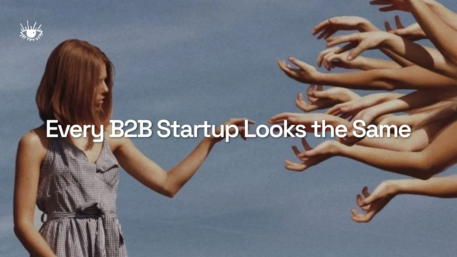
Every B2B Startup Looks the Same
Tech startup branding has collapsed into a single aesthetic. Gradient blobs, geometric sans-serifs, and safe blue palettes dominate. Here's why sameness is a strategic liability and how to build a brand identity for startups that actually stands out.
Tara Everding
The Gradient Blob Industrial Complex
Open ten B2B startup websites in a row. You’ll see the same thing: a clean sans-serif logo, a hero section with abstract gradients or floating 3D shapes, a blue-to-purple color palette, and copy that talks about “empowering teams” to do something “at scale.”
This isn’t a coincidence. It’s the result of an entire ecosystem optimizing for safety.
Founders look at what funded companies look like. Designers reference what’s trending on Dribbble. Brand agencies build mood boards from the same pool of successful tech companies. The result is convergence. Everyone ends up in the same visual and verbal territory because everyone is referencing each other.
The irony is thick: companies that exist to disrupt their categories are presenting themselves in the most conventional way possible.
Why Sameness Happens (and Why It Feels Rational)
There’s a logic to blending in. When you’re pitching investors, you want to look like a “real company.” When you’re selling to enterprise buyers, you want to feel trustworthy. Familiar aesthetics signal legitimacy.
That logic holds up right until you realize your prospects can’t tell you apart from three other companies in the same space.
Brand recall depends on distinctiveness. Les Binet and Peter Field’s research on B2B marketing effectiveness (through the B2B Institute at LinkedIn) has shown that brand building drives long-term growth, and that distinctive brand assets are the mechanism. If your visual identity could be swapped with a competitor’s and nobody would notice, you don’t have a brand. You have a template.
This is where early-stage founders make a costly miscalculation. They treat brand identity as a cosmetic layer, something you apply after the product works, rather than a strategic asset that compounds over time.
The Sameness Checklist
You might be stuck in the sameness trap if your brand includes three or more of the following:
A geometric sans-serif wordmark. A primary palette built around blue, purple, or teal. Hero illustrations featuring abstract shapes, blobs, or isometric graphics. Stock photography of diverse teams in glass-walled offices. Taglines using “empower,” “unlock,” “seamless,” or “at scale.” A website that follows the exact same scroll pattern: hero, social proof logos, three feature cards, testimonial, CTA.
Individually, none of these are wrong. Together, they form a uniform. And uniforms are designed to make people interchangeable.
What Distinctive Brands Do Differently
The B2B companies that build real brand equity make deliberate choices that create friction with the default. They pick a direction and commit.
They choose a point of view, visually. Gong went with bold, high-contrast colors and an irreverent voice when the rest of the revenue intelligence category was corporate and muted. Linear chose an almost brutalist minimalism that signals craft and precision. These choices feel risky in a vacuum, but they’re the reason these brands are instantly recognizable.
They write like humans. The copy on most B2B sites reads like it was generated by committee (or, increasingly, by a language model on default settings). Distinctive brands have a voice that sounds like a specific person or culture. They use words their competitors wouldn’t. They take stances. Basecamp built an entire brand around being opinionated about how work should happen.
They invest in brand identity early. The startup brand identity design process doesn’t have to be a six-month, six-figure engagement. What matters is making intentional choices before your visual language calcifies through rushed decisions. A focused sprint with a boutique creative agency that understands tech startups can establish a foundation that lasts years.
They say no. Distinctiveness requires trade-offs. You can’t appeal to everyone and stand out to someone. The brands that break through are willing to alienate part of the market to resonate deeply with their actual audience.
The Cost of Playing It Safe
Here’s what founders underestimate: being forgettable is expensive.
When your brand looks like everyone else’s, every impression costs more because it doesn’t stick. Your sales team spends more time explaining who you are on calls because prospects don’t remember you between touchpoints. Your content performs worse because there’s nothing distinctive pulling people back. Your recruiting pitch is weaker because top talent gravitates toward companies with a clear identity and perspective.
The compounding cost of a generic brand is invisible in any single quarter. Over two or three years, it’s enormous.
A Practical Starting Point
If you’re a founder reading this and recognizing your own brand in the sameness checklist, here’s where to start:
Audit your category. Screenshot the top ten competitors’ websites. Put them side by side. Identify the shared conventions. Those conventions are what you need to break.
Find your brand’s opinion. What does your company believe about the world that your competitors don’t? This isn’t your mission statement. It’s the underlying worldview that drives your product decisions. That opinion should show up in everything, from your color palette to your homepage headline.
Hire for taste, not templates. When you work with a creative agency for tech companies, look for a partner who pushes back on safe choices. If your agency shows you a mood board that looks like the rest of your category, that’s a red flag.
Commit. Half-measures produce half-results. If you’re going to differentiate your brand, go far enough that people notice. A slightly different shade of blue won’t do it.
The Window Is Open
The current state of B2B tech branding is a market inefficiency. When everyone looks the same, standing out requires less effort than you’d expect. A startup that invests in a distinctive brand identity today captures disproportionate attention and recall in its category.
That window won’t stay open forever. As more founders recognize the sameness problem, the bar for distinctiveness will rise. The advantage goes to companies that move now.
Your brand is the first product your market experiences. Make it one they remember.
Work With Us
Related Articles
The Death of the Generic Tech Voice
Every startup landing page now sounds like it came out of the same committee of growth advisors, and buyers have quietly stopped reading. Here's why the friendly, frictionless, future-forward voice lost its power, and what a distinctive verbal identity looks like when a founder finally commits to sounding like an actual person.
July 5, 2026
The Case for Opinionated Design in B2B
B2B SaaS design has flattened into one safe aesthetic. Here's why opinionated visual choices like distinctive type, unexpected color, and real illustration give startups a measurable edge in brand recall and conversion, with a practical look at how to build brand identity for startups that takes a side.
June 5, 2026
Your Category Is Being Summarized Without You
AI answer engines send almost no traffic yet, which is why most founders are ignoring them. That's a mistake for a reason nobody's selling you a tool for: startup brand strategy now has to survive being described secondhand by a machine that has never seen your landing page.
August 21, 2026